This Week’s Work
- Finished initial mockup for the UI (see below)
- Started work on UI implementation (see below)
Schedule
Out of the 4 targets from the last update, I’ve completed 2 tasks (highlighted in green) and 2 tasks are unstarted (highlighted in red).
- Complete UI mockup
- Start implementation of the UI in code
- Last time I set the target as “Start implementation of the UI in code (with faked sensor data)” but I realized that didn’t make sense so I removed the “with faked sensor data” for this update.
- Start implementation of turn signal control
- Start radar tuning
With respect to the software side of the UI, I am currently on track. However, I am behind with respect to the turn signal control software and radar tuning as both should have been started at this point. I plan to discuss with the rest of the team on the radar timeline as I may not have time this upcoming week to tune the radar.
Upcoming Deliverables
The main deliverables for this week are:
- Complete initial implementation of main screen code (with faked sensor data)
- Start integration with Jack’s radar code
- Start implementation of turn signal control
- Start radar tuning
Updated UI Mockup
After last week, I realized that the range indicator for a bicycle which looked similar to a wifi indicator could be ambiguous as to the meaning. For example, if the range indicator is full strength, does that mean the car is near or far?
Therefore, I redesigned the range indicator to be similar to what Toyota has for their parking assist proximity sensing system (see “Distance Display” under this page from the 2021 Venza manual). Under the new system, an arc will light up corresponding to the range of the detected car, with further arcs indicating a longer distance. The color of the arc will also serve as a visual cue, with green indicating far, yellow indicating medium, and red indicating close range.
Other changes this week include:
- Removing the vehicle indicator, previously indicated by grey boxes on the old UI
- Fixed empty space above emergency braking background
- Added turn signals (based off of Tesla’s turn signal design – see here in the Model Y owner’s manual)
For comparison, here’s the old design:
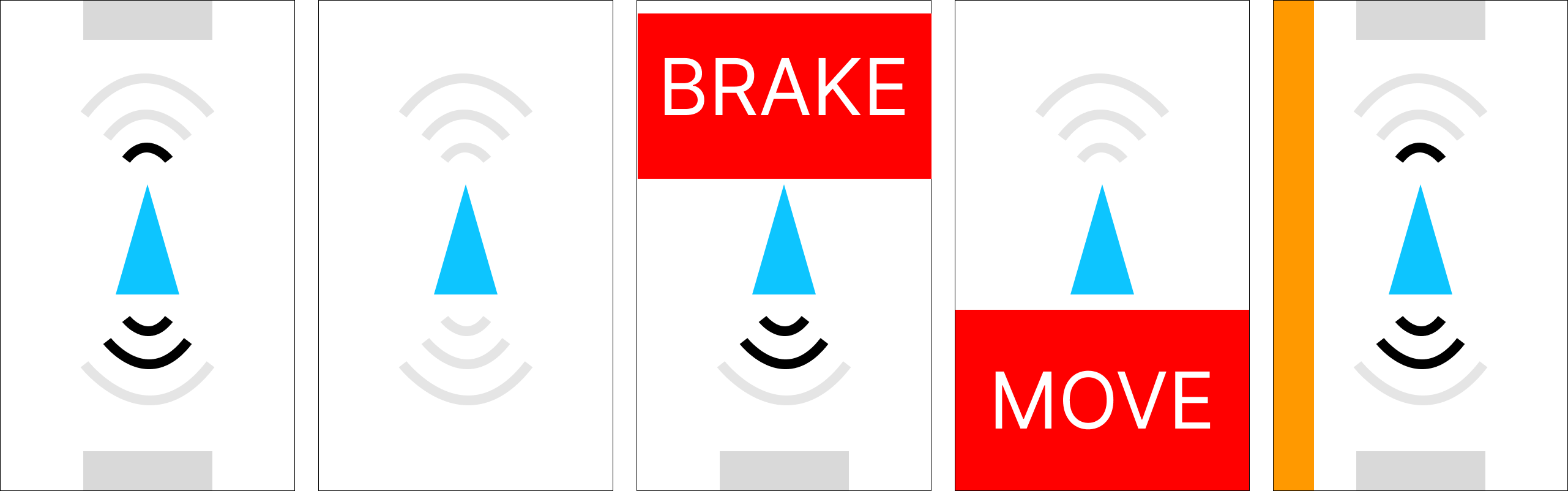
And here’s the new design:

From left to right, the screens display:
- Vehicles detected both in front and behind – the front vehicle is at a medium range, and the rear vehicle is at a far range
- No vehicles detected in front or behind
- Forward collision warning triggered
- Rear collision warning triggered
- Blind spot monitoring – A vehicle is in the left lane besides us
- The last two panels are for animating the turn signal – in this case, we have a left turn signal
Future work will include adding a hazard toggling button and perhaps a debug panel or some other way to show debug information.
State of the UI
Here’s the state of the UI at the time of writing:

The icons are exported from Figma, and the flashing turn signals are driven by the turn signal application logic.