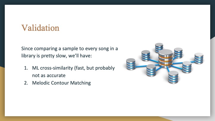
Final Presentation Slides
Wenting: The Final Status Report
I’ve made a ton of progress since last week. As mentioned last week, I was looking for a library to capture audio and had to do a lot of digging to find one to save .wavs, which is the audio file format being used for the backend processing. I’ve never worked with React before this so it has been a big learning experience.
I’ve gotten almost all the features for the web app implemented. The user can record a clip that is then posted to a Flask server and saved. The file is then passed to Matlab for processing and the results (melodic contours, matched song titles) returned back to the frontend for rendering the visual results. My last task is to get the results to display at the correct time. I have put together the design for displaying and just need to have it trigger at the right time (i.e. when the processing is complete).
Public demo is in 2 days so all I can say is it’ll be done by then. 🙂
Team Status Report 10
We all made significant progress this week with the challenges mentioned last week and are pushing forward to the end. While we are still concerned that our system will be slow or not work very well, we are hopeful for decent results.
We are still lagging a bit behind but obviously the clock is ticking, so we are doing our best to reach the optimal state possible come public demo.
Wenting: Status Report 10
This week I did more work on the app in both the visual design, adding pages, and connecting to the backend. My challenge this week was finding an audio recording library to use on the web app and integrating it with what I’ve already done. I also need work on how to trigger Matlab to run when the audio has been captured and then return the results back to the front end.
I am currently behind and have a lot to do before the final demo. I know the resources that I can use and reach out to for help though, so I am confident in my ability to get it done.
Wenting: Status Report 9
This week I worked on putting together the web app and refining visualizations. I currently plan on having the following visualizations:
For a matched song
- A “percent” representing how close the match was based on a weighted score from melody contour analysis and the similarity matrix
- The sung input plotted on top of the original song
- Histogram showing the distribution of distances (difference between original and input)
For a non-matched song
- List of top match(es)
- The same visuals as for the matched song but for each song
Possible additional features
- Link to the song on Youtube/Spotify
- A Yes/No button to determine whether Earworm was correct or not (good for feedback?)
As of the coming demo, I will be on track and just need to do further refinement based on feedback and integration.
Team Status Report 9
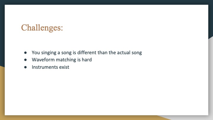
This week we each ran into some obstacles with our parts. Pitch detection and finding patterns cross similarity matrices were challenges that we foresaw but are still formidable, and none of us have much experience with web development.
We are a bit behind schedule but are working hard to overcome it!
Wenting Status Report 8 + Team Status
Wenting:
This week I started playing with the histogram idea to show the distribution of distances to the actual melody. I am debating whether I want to show absolute distance or both positive/negative as that may determine whether someone was singing flat or sharp, or simply which way they were off by.
Again, I am behind schedule but will need to actually have the website built by the end of next week since the clock is ticking till final demo, and I need to work on integrating the data visualization into the website and with other parts.
Team:
As predicted, all of us were very busy with carnival commitments this past week and were not able to do that much. However, we will be majorly kicking into gear this week for each of our parts.
Although we are a little behind, we are confident about finishing what we need to get done.
Wenting: Status Report 7 + Team Status
Wenting:
This week I demo’d and received helpful feedback for the data visualization aspects. I was plotting the original song against the sung input (although both are still contrived examples and coloring the space between them with some color in the gradient from red to green, where red meant it was not a close match and green meant it was a close match. However, I neglected to include a scale which made it hard to interpret the graph. Since it is a gradient, the colors are not necessarily very comparable so it will be hard to discern particularly as the length of the sample grows and there are more colors in the gradient.
Suggestions from course staff included plotting the distances between notes and making a histogram to show the distribution of distances. Also, coloring the actual line of the melody as red/yellow/green is more indicative, and I think with that I could add toggle options to display just the sung input, the sung input and the melody it was matched to, or just the matched melody. This is an option that I have considered and am still tinkering with.
While I did most of my work for the demo in Python, I may port it over to Matlab for easier interfacing with the other parts. Also, I would like to start working on the pipeline from the two branches of audio analysis to data visualization, since that will be a key part of my portion.
I think I am a little behind schedule since I wanted to spin up a basic website by this week but that has not been done, and I would like to be further along in prototyping data visualization techniques.
Team:
Post interim demo, we are all working on pushing forward with the next steps on each of our parts. The suggestions and comments made by course staff were helpful for us to work off of for the next few weeks, and we feel confident that we will have enough time to finish what we have to do.
The risks that we are facing have not changed much, though there may be a big push at the end to put all the parts together into one system, which is to be expected. As this coming week is carnival and we all have commitments to carnival events, we will all be busy but will try to still be on track.
Some parts have not moved as quickly as originally estimated, but overall our team is in a good place schedule-wise – we know what we need to get done and have a good sense of time about it.
Wenting: Status Report 6
This week I delved more into the implementation of the data visualization techniques. I want for it to be visually obvious what parts are a close match and what parts are not, so there should be a red to green scale in some way or form, where red means that part is not a close match and green means it is a close match. This can be done through shading the differences between the graphs, or simply coloring the line representing the melody based on how close it is to the closest matched melody, though this would probably be harder to see.
A thought to consider is whether or not the input should be plotted against each song separately, or if the information can be aggregated into one visual. Using either of the methods mentioned above, they would have to be separate to be meaningful. I will be continuing to explore what methods are effective and most telling of the process.
I have not done much work on visualization for the CNN branch yet because it’s more difficult to do without data. To combat this I may try generating test matrices similar to the ones shown in this paper to explore some options. Perhaps using the similarity features we can pull out the bits of melody that were found to be matching.
Since our computation will largely be in Matlab, it may be easier to develop a web app instead of a mobile app. With that in mind, my goal for next week will be to spin up a basis/frame for the app.